Allevita Natural Relief
About
Allevita is a CBD-based PMS supplement made with a blend of vitamins, minerals, botanical extracts and whole-plant hemp-derived CBD. With separate daytime and nighttime formulas, the brand was designed to support different moments throughout the day while keeping the overall experience simple and approachable.
The brief was to create a wellness brand that felt natural and holistic, but still modern, elevated and easy to trust.
client
Sarah Wander
Year
Spring 2019
Services
Art Direction
Branding
Packaging
Website
Allevita Natural Relief
About
Allevita is a CBD-based PMS supplement made with a blend of vitamins, minerals, botanical extracts and whole-plant hemp-derived CBD. With separate daytime and nighttime formulas, the brand was designed to support different moments throughout the day while keeping the overall experience simple and approachable.
The brief was to create a wellness brand that felt natural and holistic, but still modern, elevated and easy to trust.
client
Sarah Wander
Year
Spring 2019
Services
Art Direction
Branding
Packaging
Website
Allevita Natural Relief
About
Allevita is a CBD-based PMS supplement made with a blend of vitamins, minerals, botanical extracts and whole-plant hemp-derived CBD. With separate daytime and nighttime formulas, the brand was designed to support different moments throughout the day while keeping the overall experience simple and approachable.
The brief was to create a wellness brand that felt natural and holistic, but still modern, elevated and easy to trust.
client
Sarah Wander
Year
Spring 2019
Services
Art Direction
Branding
Packaging
Website

The Challenge
Natural wellness brands can easily lean too far into familiar “crunchy” visual cues, while products focused on symptom support can often feel overly clinical or medicinal.
The challenge was to find a balance between those two worlds. Allevita needed to communicate the warmth and approachability of a holistic product without losing the credibility, clarity and sophistication expected from something people are incorporating into their daily routine.
The Challenge
Natural wellness brands can easily lean too far into familiar “crunchy” visual cues, while products focused on symptom support can often feel overly clinical or medicinal.
The challenge was to find a balance between those two worlds. Allevita needed to communicate the warmth and approachability of a holistic product without losing the credibility, clarity and sophistication expected from something people are incorporating into their daily routine.
The Challenge
Natural wellness brands can easily lean too far into familiar “crunchy” visual cues, while products focused on symptom support can often feel overly clinical or medicinal.
The challenge was to find a balance between those two worlds. Allevita needed to communicate the warmth and approachability of a holistic product without losing the credibility, clarity and sophistication expected from something people are incorporating into their daily routine.


Our Approach
We built the brand around a visual language that felt warm, calm and contemporary. Rather than relying on the earthy colors and rustic details often associated with natural supplements, we used a cleaner, more refined system that still felt soft and human.
The daytime and nighttime formulas were given their own identities while remaining part of the same family, creating an intuitive system that made the two products easy to understand at a glance.
The result was a brand that felt rooted in natural wellness without being defined by it; modern, approachable and designed to fit naturally into an everyday self-care routine.
Our Approach
We built the brand around a visual language that felt warm, calm and contemporary. Rather than relying on the earthy colors and rustic details often associated with natural supplements, we used a cleaner, more refined system that still felt soft and human.
The daytime and nighttime formulas were given their own identities while remaining part of the same family, creating an intuitive system that made the two products easy to understand at a glance.
The result was a brand that felt rooted in natural wellness without being defined by it; modern, approachable and designed to fit naturally into an everyday self-care routine.
Our Approach
We built the brand around a visual language that felt warm, calm and contemporary. Rather than relying on the earthy colors and rustic details often associated with natural supplements, we used a cleaner, more refined system that still felt soft and human.
The daytime and nighttime formulas were given their own identities while remaining part of the same family, creating an intuitive system that made the two products easy to understand at a glance.
The result was a brand that felt rooted in natural wellness without being defined by it; modern, approachable and designed to fit naturally into an everyday self-care routine.


Next Projects
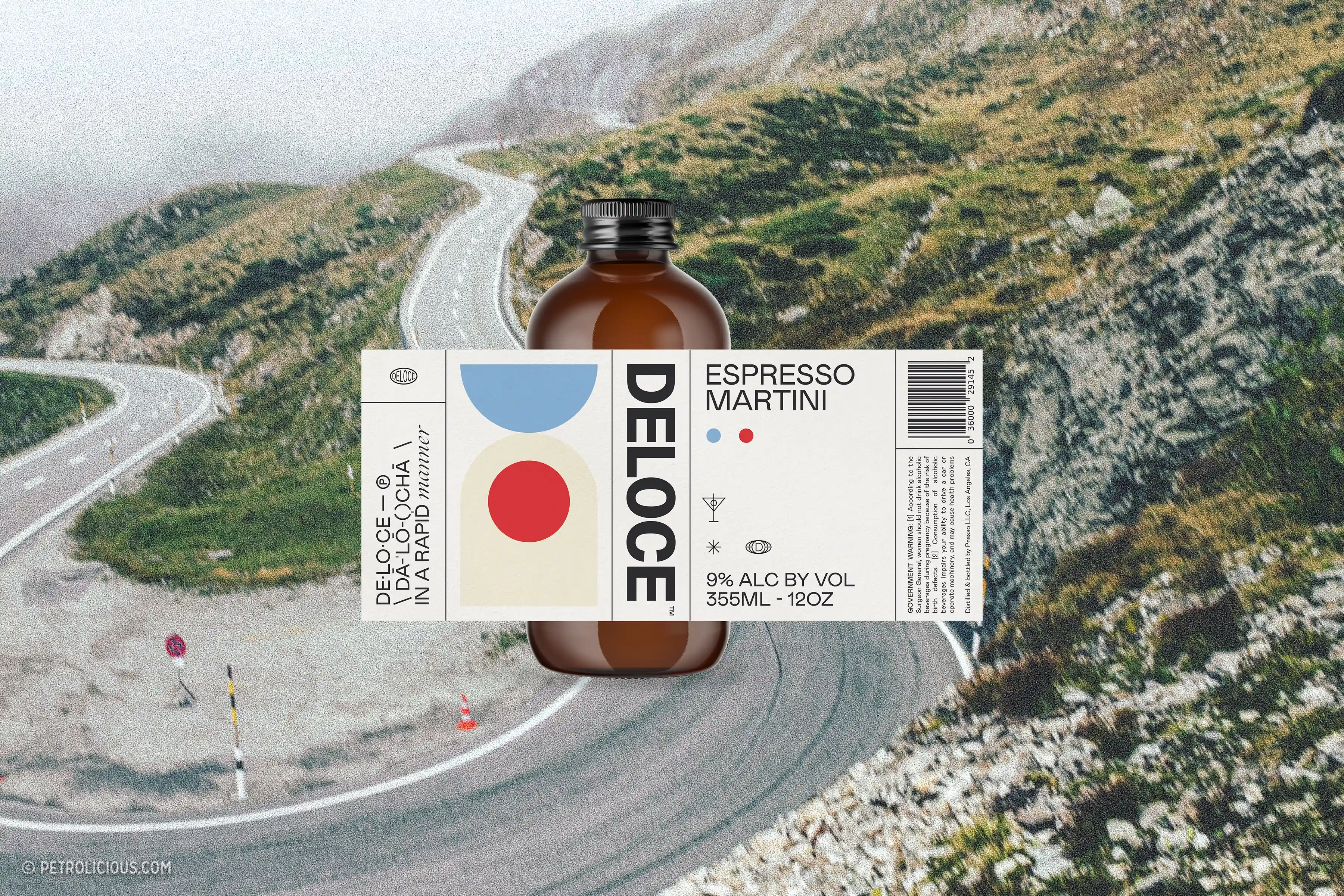
Deloce Espresso Martini
Design, Packaging, Website Design

Two Truths Photography
Art Direction
Next Projects
Deloce Espresso Martini
Design, Packaging, Website Design
Two Truths Photography
Art Direction
Next Projects
Deloce Espresso Martini
Design, Packaging, Website Design
Two Truths Photography
Art Direction