Beyond the Streets
About
Beyond the Streets celebrates graffiti and street art in all of its forms, bringing together artists with completely different styles, mediums and points of view.
For the Los Angeles exhibition, we created a digital home for the show that allowed people to explore the artwork and discover the artists behind it. The site needed to hold a huge range of work while still feeling connected to the culture the exhibition came from.
client
Roger Gastman
Year
Fall 2019
Services
Website Design
Beyond the Streets
About
Beyond the Streets celebrates graffiti and street art in all of its forms, bringing together artists with completely different styles, mediums and points of view.
For the Los Angeles exhibition, we created a digital home for the show that allowed people to explore the artwork and discover the artists behind it. The site needed to hold a huge range of work while still feeling connected to the culture the exhibition came from.
client
Roger Gastman
Year
Fall 2019
Services
Website Design
Beyond the Streets
About
Beyond the Streets celebrates graffiti and street art in all of its forms, bringing together artists with completely different styles, mediums and points of view.
For the Los Angeles exhibition, we created a digital home for the show that allowed people to explore the artwork and discover the artists behind it. The site needed to hold a huge range of work while still feeling connected to the culture the exhibition came from.
client
Roger Gastman
Year
Fall 2019
Services
Website Design

The Challenge
Graffiti is physical by nature. It lives on walls, trains, signs and buildings and is defined by scale, texture, imperfection and the environment around it.
A website is almost the opposite: structured, clean and contained. The challenge was to translate the raw energy of the exhibition into a digital space without making it feel overly polished or letting the design compete with the work itself.
At the same time, the site needed to bring together a huge variety of artists and styles without forcing everything into one visual mold.
The Challenge
Graffiti is physical by nature. It lives on walls, trains, signs and buildings and is defined by scale, texture, imperfection and the environment around it.
A website is almost the opposite: structured, clean and contained. The challenge was to translate the raw energy of the exhibition into a digital space without making it feel overly polished or letting the design compete with the work itself.
At the same time, the site needed to bring together a huge variety of artists and styles without forcing everything into one visual mold.
The Challenge
Graffiti is physical by nature. It lives on walls, trains, signs and buildings and is defined by scale, texture, imperfection and the environment around it.
A website is almost the opposite: structured, clean and contained. The challenge was to translate the raw energy of the exhibition into a digital space without making it feel overly polished or letting the design compete with the work itself.
At the same time, the site needed to bring together a huge variety of artists and styles without forcing everything into one visual mold.

Our Approach
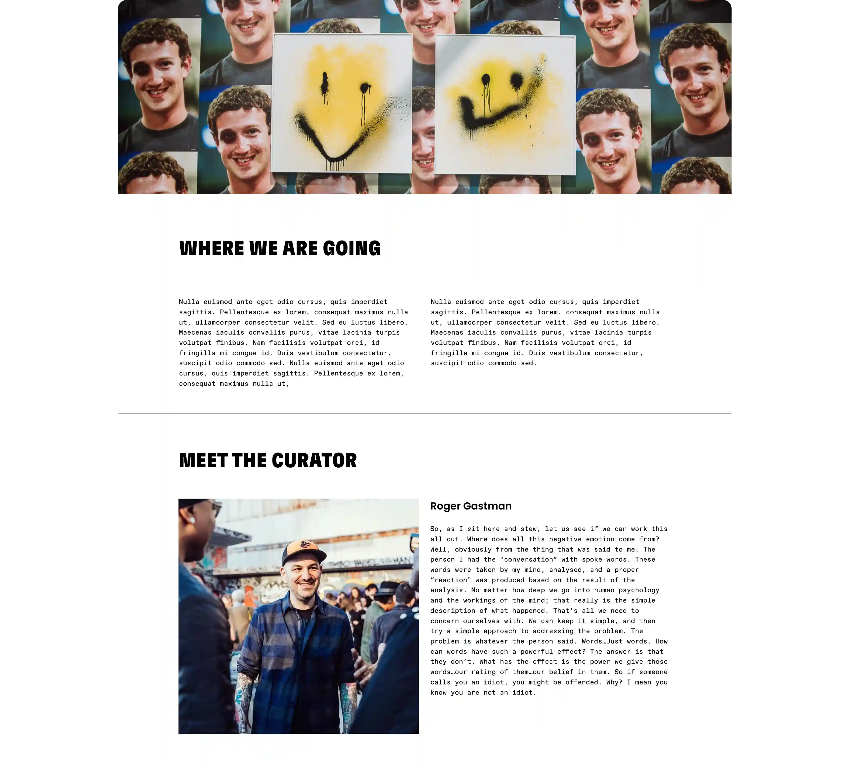
We created a system that mixed the structure of an editorial website with the roughness and energy of the street. A mostly black-and-white palette gave the artwork room to stand out, while bright red accents, oversized condensed type and large-scale numbers added moments of impact.
Rather than keeping everything neatly contained, images and typography overlap and break through the grid. Gritty textures, hand-drawn marks and monospaced typography added another layer of imperfection and made the experience feel closer to a zine, poster or piece of printed ephemera than a traditional gallery website.
The grid underneath it all remained intentionally structured, giving us a consistent framework for presenting a huge range of artists and work. That balance allowed the site to feel raw and expressive without becoming chaotic, and gave each artist enough space for their work to take over the page.
Our Approach
We created a system that mixed the structure of an editorial website with the roughness and energy of the street. A mostly black-and-white palette gave the artwork room to stand out, while bright red accents, oversized condensed type and large-scale numbers added moments of impact.
Rather than keeping everything neatly contained, images and typography overlap and break through the grid. Gritty textures, hand-drawn marks and monospaced typography added another layer of imperfection and made the experience feel closer to a zine, poster or piece of printed ephemera than a traditional gallery website.
The grid underneath it all remained intentionally structured, giving us a consistent framework for presenting a huge range of artists and work. That balance allowed the site to feel raw and expressive without becoming chaotic, and gave each artist enough space for their work to take over the page.
Our Approach
We created a system that mixed the structure of an editorial website with the roughness and energy of the street. A mostly black-and-white palette gave the artwork room to stand out, while bright red accents, oversized condensed type and large-scale numbers added moments of impact.
Rather than keeping everything neatly contained, images and typography overlap and break through the grid. Gritty textures, hand-drawn marks and monospaced typography added another layer of imperfection and made the experience feel closer to a zine, poster or piece of printed ephemera than a traditional gallery website.
The grid underneath it all remained intentionally structured, giving us a consistent framework for presenting a huge range of artists and work. That balance allowed the site to feel raw and expressive without becoming chaotic, and gave each artist enough space for their work to take over the page.


Next Projects

Allevita Natural Relief
Art Direction, Branding, Packaging, Website
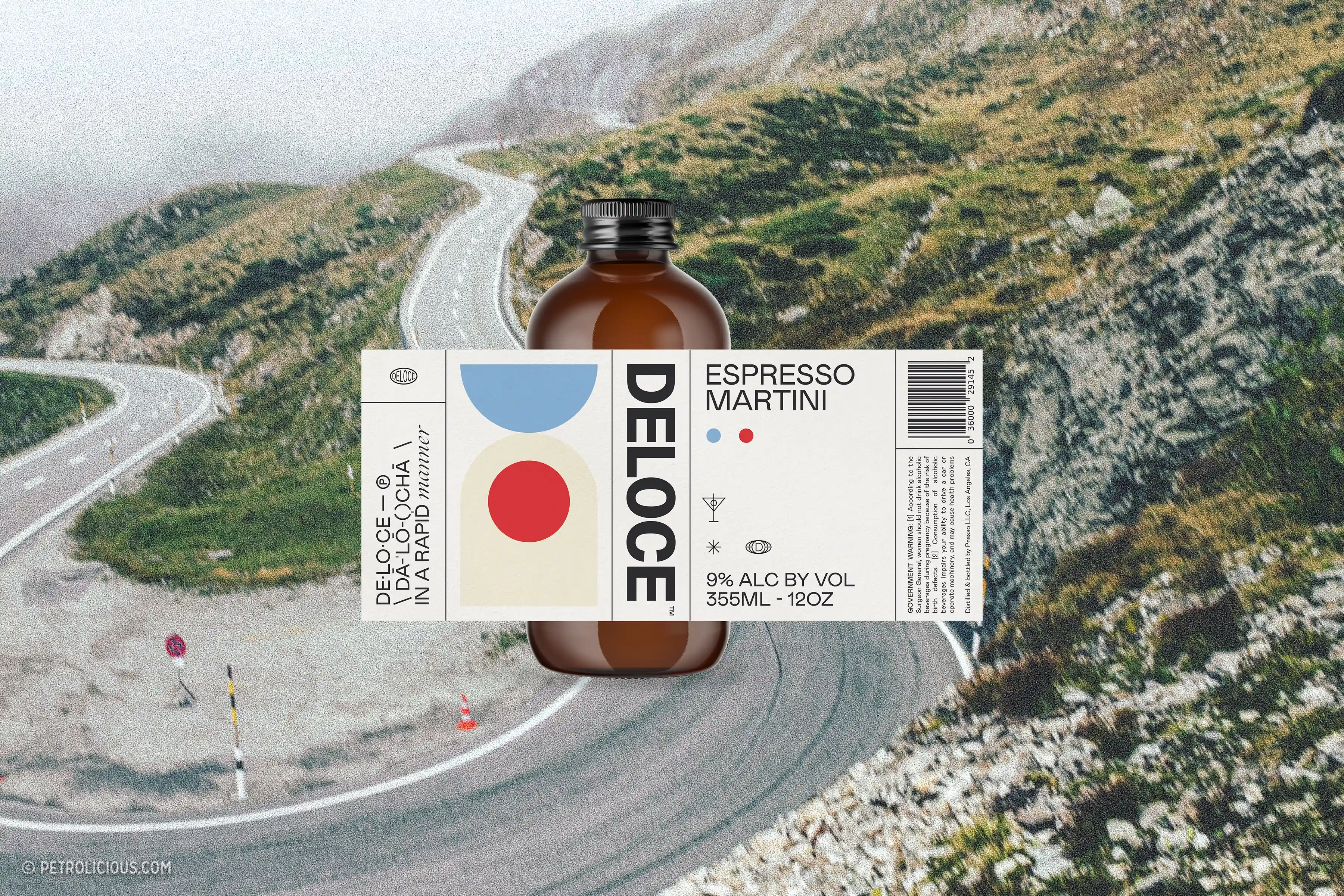
Deloce Espresso Martini
Design, Packaging, Website Design
Next Projects
Allevita Natural Relief
Art Direction, Branding, Packaging, Website
Deloce Espresso Martini
Design, Packaging, Website Design
Next Projects
Allevita Natural Relief
Art Direction, Branding, Packaging, Website
Deloce Espresso Martini
Design, Packaging, Website Design