Riple Efek Natural Detergent
About
We spend a lot of time thinking about what goes directly on our skin, but far less about what goes on the clothes that touch it all day.
The brief was to create a bio-based laundry detergent built around the idea that caring for your skin should start before you get dressed. Made with naturally derived ingredients, the product reframed an everyday household essential as part of a broader self-care routine.
client
Shawnique Alexander
Year
Fall 2021
Services
Art Direction
Branding
Packaging
Website
Riple Efek Natural Detergent
About
We spend a lot of time thinking about what goes directly on our skin, but far less about what goes on the clothes that touch it all day.
The brief was to create a bio-based laundry detergent built around the idea that caring for your skin should start before you get dressed. Made with naturally derived ingredients, the product reframed an everyday household essential as part of a broader self-care routine.
client
Shawnique Alexander
Year
Fall 2021
Services
Art Direction
Branding
Packaging
Website
Riple Efek Natural Detergent
About
We spend a lot of time thinking about what goes directly on our skin, but far less about what goes on the clothes that touch it all day.
The brief was to create a bio-based laundry detergent built around the idea that caring for your skin should start before you get dressed. Made with naturally derived ingredients, the product reframed an everyday household essential as part of a broader self-care routine.
client
Shawnique Alexander
Year
Fall 2021
Services
Art Direction
Branding
Packaging
Website
The Challenge
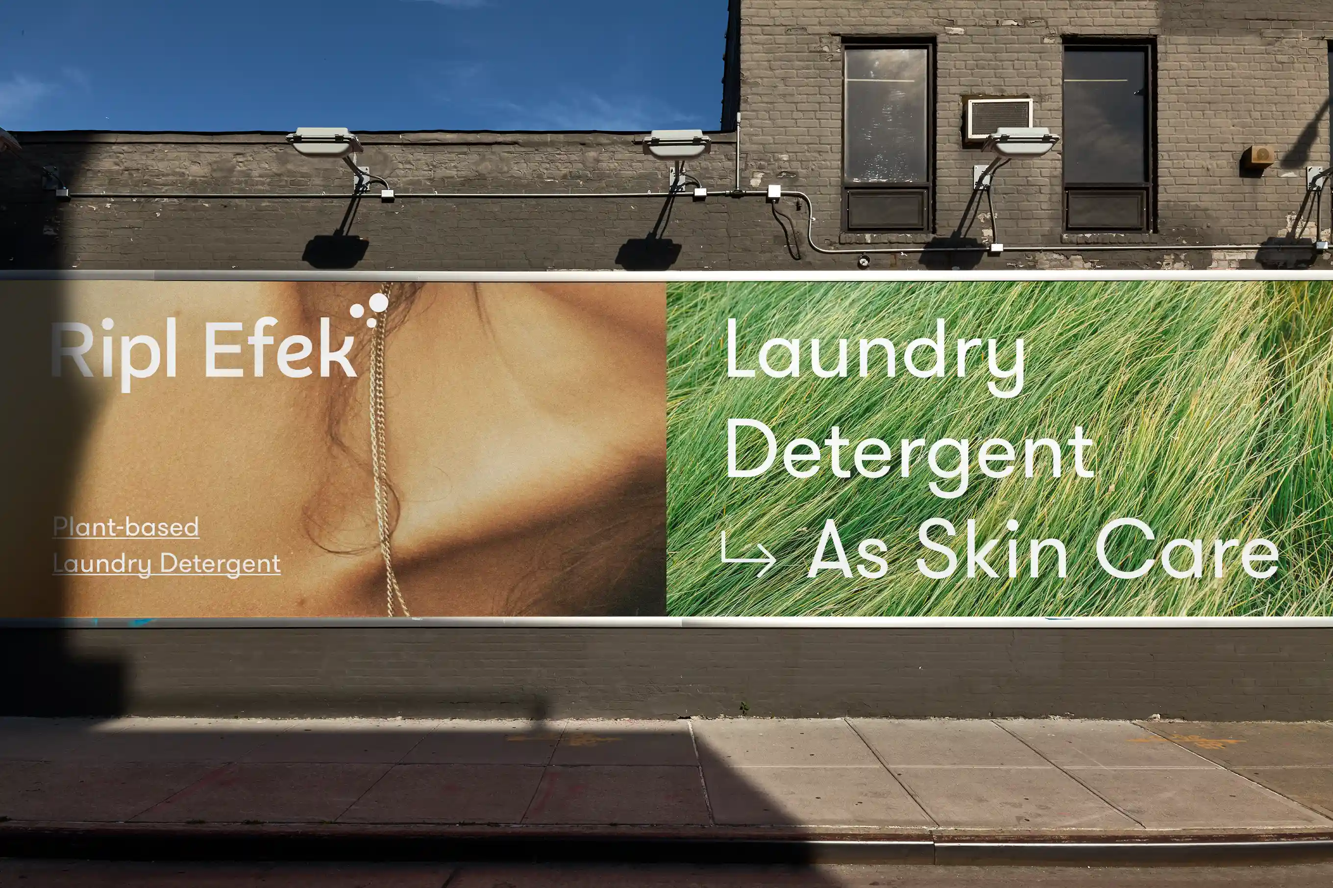
Laundry detergent is typically marketed around cleaning power, stain removal or fragrance. Natural products often swing in the opposite direction, using muted colors, minimal packaging and familiar visual cues that can make the category feel overly serious or predictable.
The challenge was to communicate that the product was thoughtful, plant-based and good for your skin without making it feel clinical, medicinal or like another traditional “eco” brand.
The Challenge
Laundry detergent is typically marketed around cleaning power, stain removal or fragrance. Natural products often swing in the opposite direction, using muted colors, minimal packaging and familiar visual cues that can make the category feel overly serious or predictable.
The challenge was to communicate that the product was thoughtful, plant-based and good for your skin without making it feel clinical, medicinal or like another traditional “eco” brand.
The Challenge
Laundry detergent is typically marketed around cleaning power, stain removal or fragrance. Natural products often swing in the opposite direction, using muted colors, minimal packaging and familiar visual cues that can make the category feel overly serious or predictable.
The challenge was to communicate that the product was thoughtful, plant-based and good for your skin without making it feel clinical, medicinal or like another traditional “eco” brand.


Our Approach
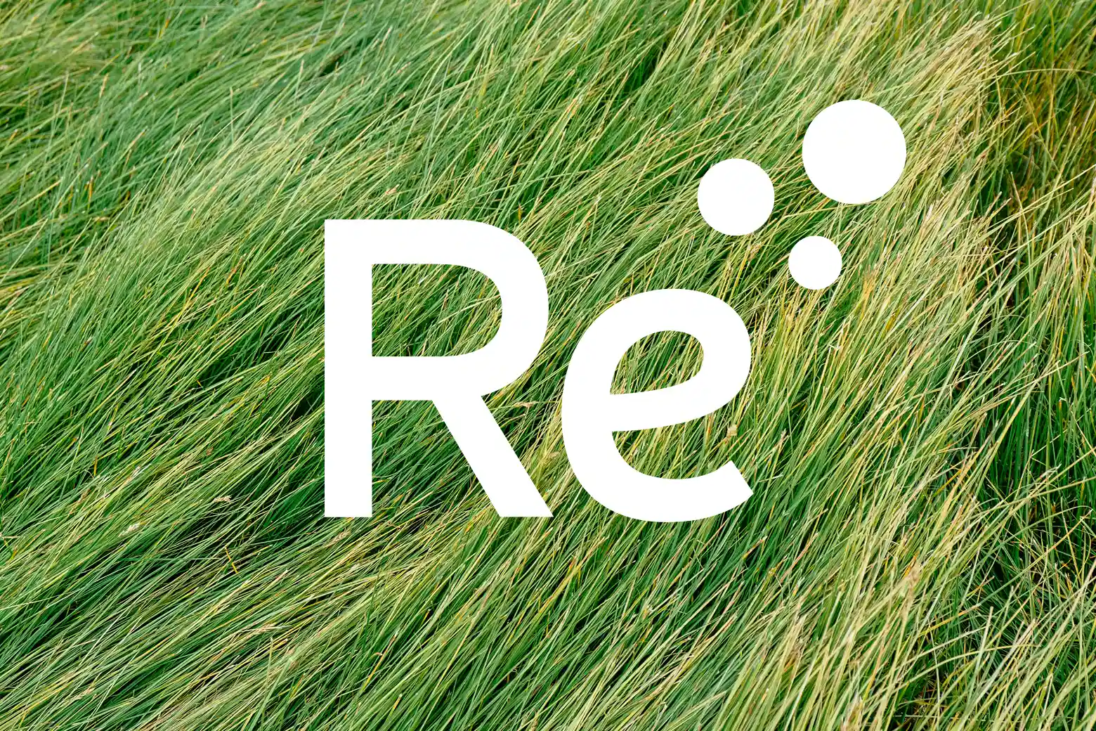
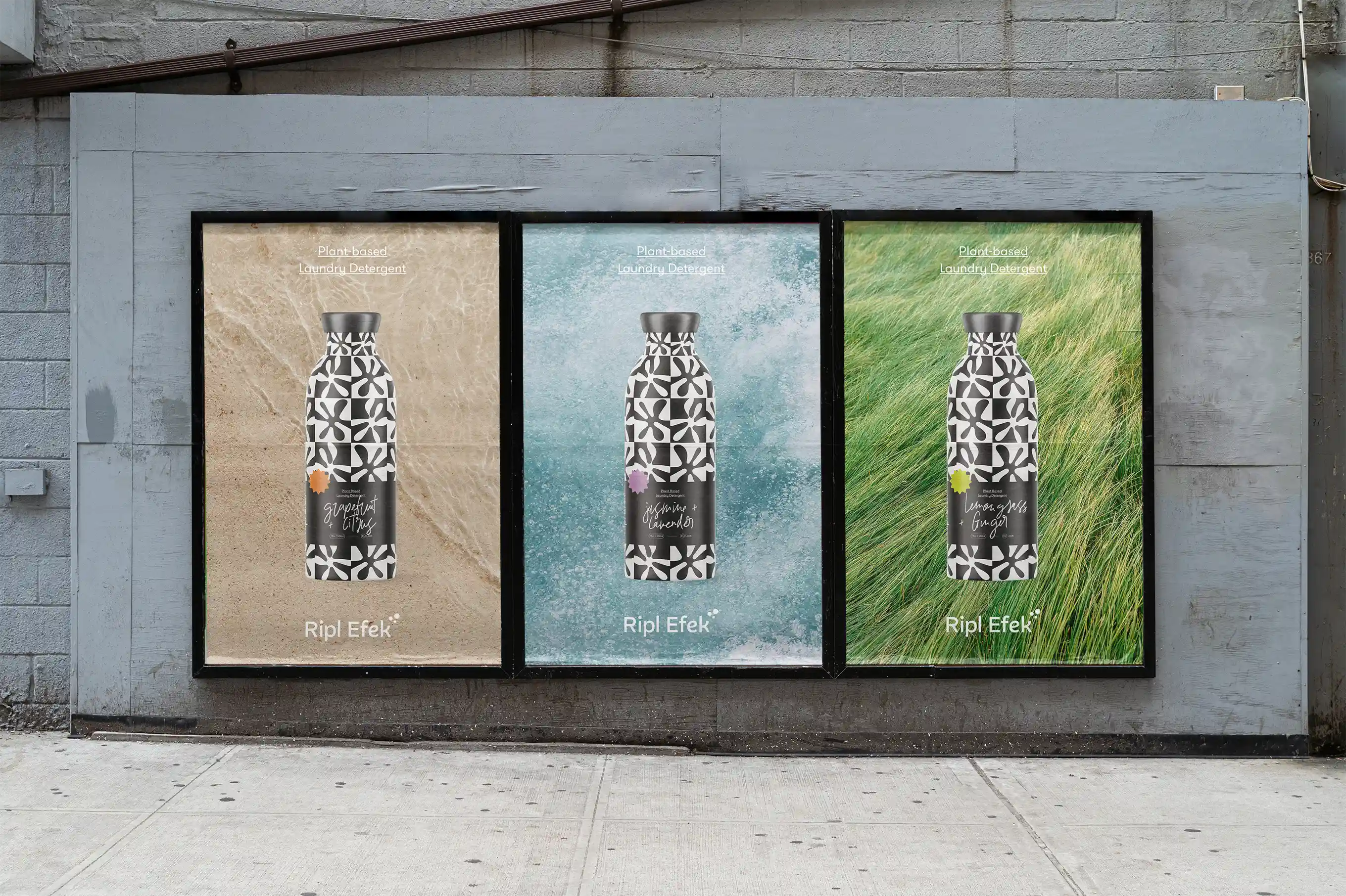
We treated the brand more like a beauty or lifestyle product than a household cleaner.
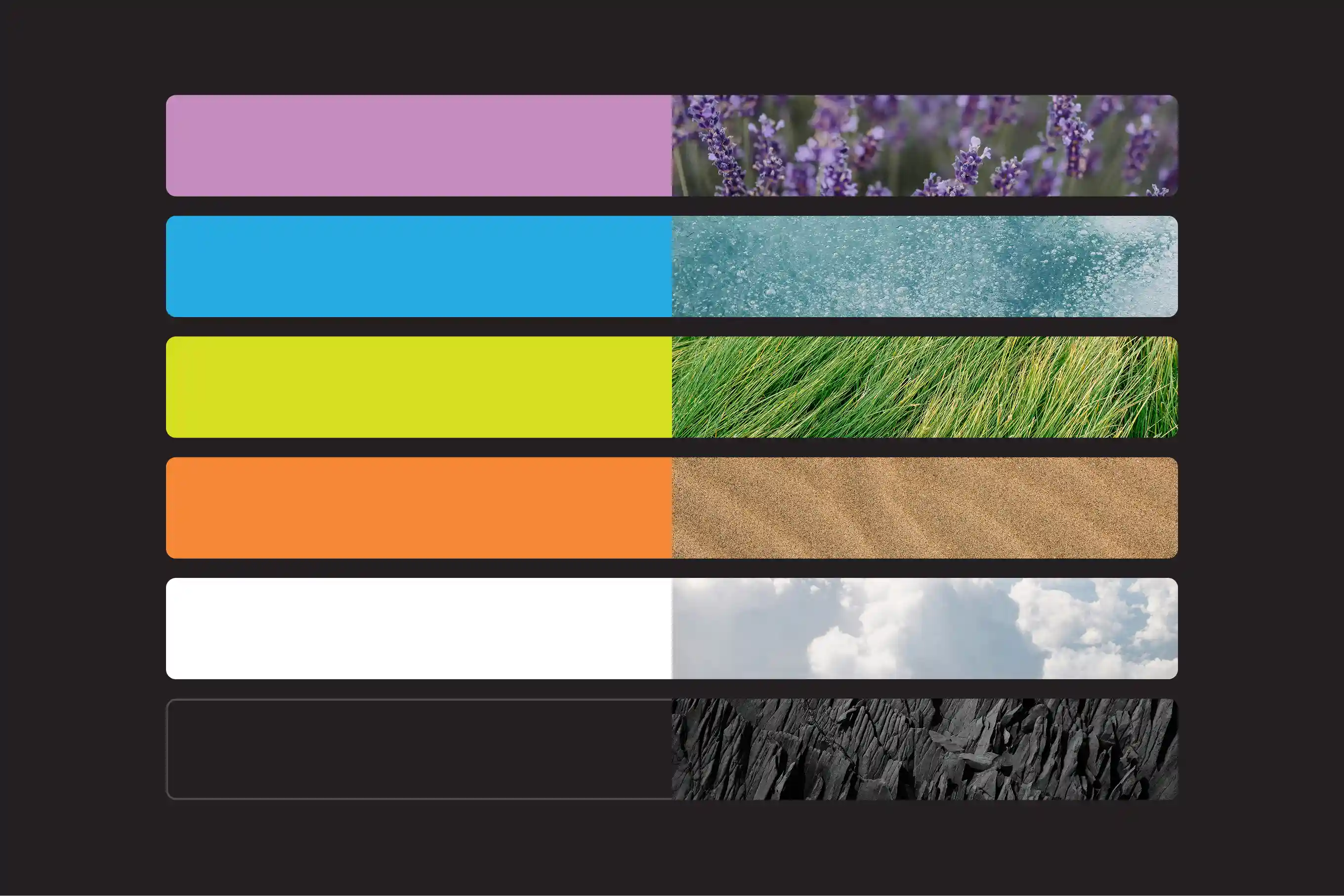
The packaging uses an oversized black-and-white pattern, expressive typography and unexpected hits of color to create something bold, youthful and visually energetic. Handwritten elements add personality and looseness, while the more structured typography and ingredient information keep the system grounded.
That contrast helped us balance two sides of the brand: natural and considered, but also fun, modern and confident. Instead of asking people to think about laundry as a chore, the identity positions it as another part of the way you care for yourself.
Our Approach
We treated the brand more like a beauty or lifestyle product than a household cleaner.
The packaging uses an oversized black-and-white pattern, expressive typography and unexpected hits of color to create something bold, youthful and visually energetic. Handwritten elements add personality and looseness, while the more structured typography and ingredient information keep the system grounded.
That contrast helped us balance two sides of the brand: natural and considered, but also fun, modern and confident. Instead of asking people to think about laundry as a chore, the identity positions it as another part of the way you care for yourself.
Our Approach
We treated the brand more like a beauty or lifestyle product than a household cleaner.
The packaging uses an oversized black-and-white pattern, expressive typography and unexpected hits of color to create something bold, youthful and visually energetic. Handwritten elements add personality and looseness, while the more structured typography and ingredient information keep the system grounded.
That contrast helped us balance two sides of the brand: natural and considered, but also fun, modern and confident. Instead of asking people to think about laundry as a chore, the identity positions it as another part of the way you care for yourself.






Next Projects

Beyond the Streets
Website Design

Allevita Natural relief
Art Direction, Branding, Packaging, Website
Next Projects
Beyond the Streets
Website Design
Allevita Natural relief
Art Direction, Branding, Packaging, Website
Next Projects
Beyond the Streets
Website Design
Allevita Natural relief
Art Direction, Branding, Packaging, Website