Two Truths Campaign
About
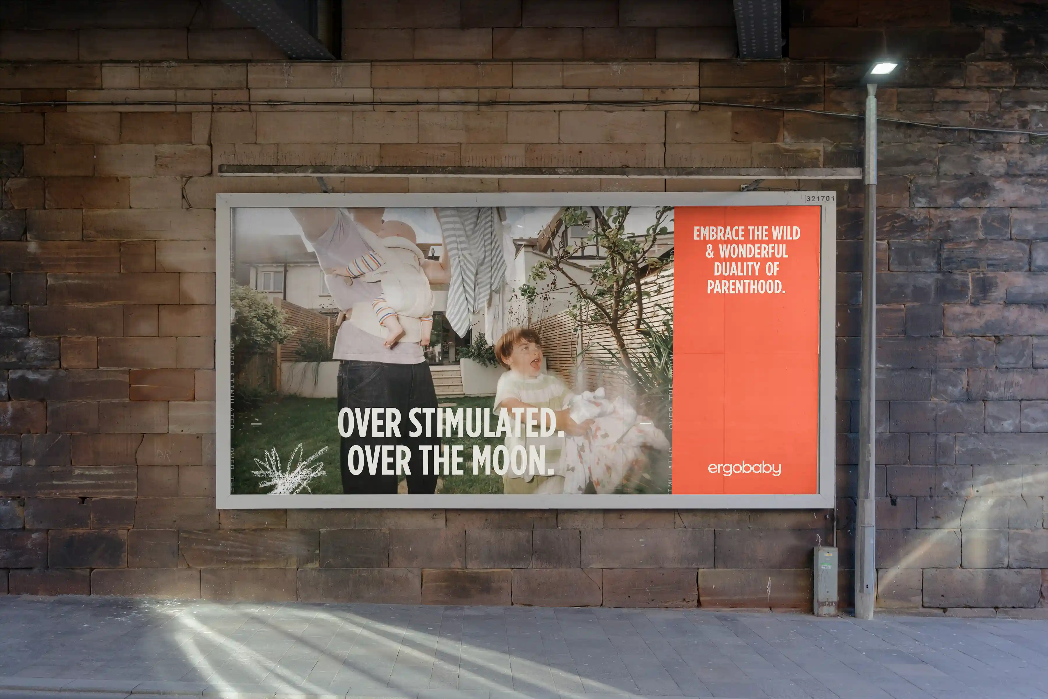
Take the visual language established in the Two Truths photography and build it into a broader brand campaign that could live across multiple channels.
This was meant to sit at the top of the funnel. Rather than focus on products or features, the goal was to build awareness and emotional connection by showing parents that Ergobaby sees the reality of what they are going through.
client
Ergobaby
Year
Fall 2025
Services
Art Direction
Design
Two Truths Campaign
About
Take the visual language established in the Two Truths photography and build it into a broader brand campaign that could live across multiple channels.
This was meant to sit at the top of the funnel. Rather than focus on products or features, the goal was to build awareness and emotional connection by showing parents that Ergobaby sees the reality of what they are going through.
client
Ergobaby
Year
Fall 2025
Services
Art Direction
Design
Two Truths Campaign
About
Take the visual language established in the Two Truths photography and build it into a broader brand campaign that could live across multiple channels.
This was meant to sit at the top of the funnel. Rather than focus on products or features, the goal was to build awareness and emotional connection by showing parents that Ergobaby sees the reality of what they are going through.
client
Ergobaby
Year
Fall 2025
Services
Art Direction
Design
The Challenge
The idea of Two Truths was simple, but it needed to become more than a photography style. We needed to create a visual system that could communicate duality clearly and consistently while still feeling emotional, human and flexible enough to work across a full campaign.
The challenge was also to keep the work from becoming too polished or overly designed. The campaign needed to feel like an honest reflection of parenthood rather than another brand trying to package it neatly.
The Challenge
The idea of Two Truths was simple, but it needed to become more than a photography style. We needed to create a visual system that could communicate duality clearly and consistently while still feeling emotional, human and flexible enough to work across a full campaign.
The challenge was also to keep the work from becoming too polished or overly designed. The campaign needed to feel like an honest reflection of parenthood rather than another brand trying to package it neatly.
The Challenge
The idea of Two Truths was simple, but it needed to become more than a photography style. We needed to create a visual system that could communicate duality clearly and consistently while still feeling emotional, human and flexible enough to work across a full campaign.
The challenge was also to keep the work from becoming too polished or overly designed. The campaign needed to feel like an honest reflection of parenthood rather than another brand trying to package it neatly.

Our Approach
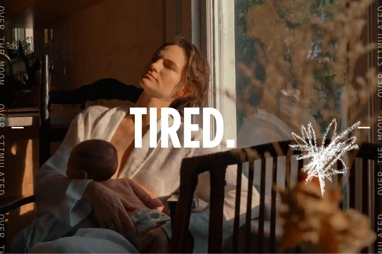
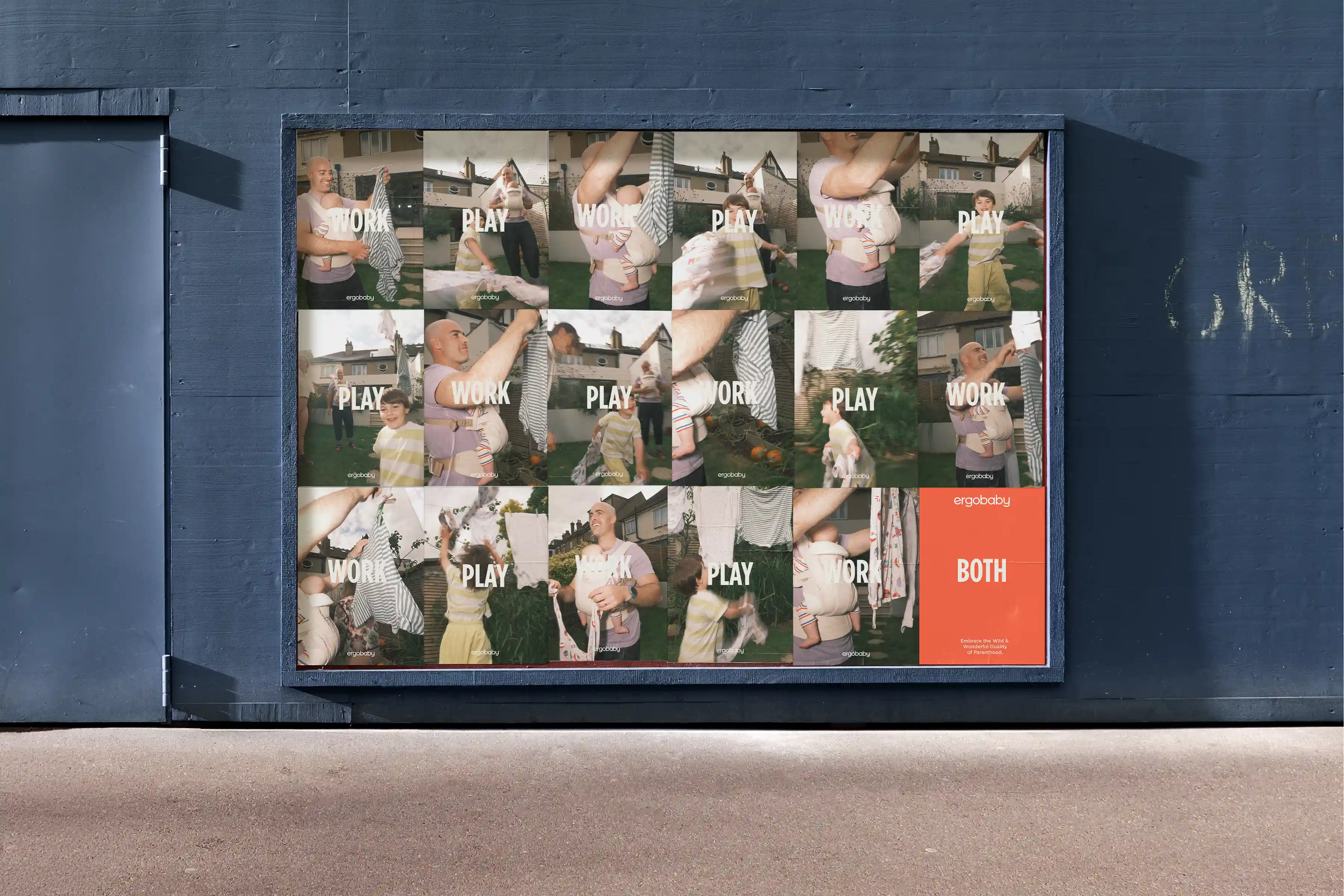
We expanded the idea of duality into every part of the campaign system. Opposing images were paired together, while oversized typography placed contrasting ideas like CHAOS/JOY and TIRED/ALIVE directly against one another.
Hand-drawn marks and annotations were layered throughout the work to emphasize certain words and add a more personal, imperfect human touch.
We also introduced a film-strip device that referenced both the rawness of analog photography and the feeling of time moving forward. Each frame became one moment in a larger sequence, reinforcing the idea that parenthood is constantly changing and that one feeling quickly gives way to another.
Together, these elements created a campaign that felt expressive, imperfect and in motion. The focus was to let parents know, we see you, and we get it.
Our Approach
We expanded the idea of duality into every part of the campaign system. Opposing images were paired together, while oversized typography placed contrasting ideas like CHAOS/JOY and TIRED/ALIVE directly against one another.
Hand-drawn marks and annotations were layered throughout the work to emphasize certain words and add a more personal, imperfect human touch.
We also introduced a film-strip device that referenced both the rawness of analog photography and the feeling of time moving forward. Each frame became one moment in a larger sequence, reinforcing the idea that parenthood is constantly changing and that one feeling quickly gives way to another.
Together, these elements created a campaign that felt expressive, imperfect and in motion. The focus was to let parents know, we see you, and we get it.
Our Approach
We expanded the idea of duality into every part of the campaign system. Opposing images were paired together, while oversized typography placed contrasting ideas like CHAOS/JOY and TIRED/ALIVE directly against one another.
Hand-drawn marks and annotations were layered throughout the work to emphasize certain words and add a more personal, imperfect human touch.
We also introduced a film-strip device that referenced both the rawness of analog photography and the feeling of time moving forward. Each frame became one moment in a larger sequence, reinforcing the idea that parenthood is constantly changing and that one feeling quickly gives way to another.
Together, these elements created a campaign that felt expressive, imperfect and in motion. The focus was to let parents know, we see you, and we get it.


credits
Client
Art Director
Designer
Producer
Photographer
Ergobaby
Benjamin Juhlin
Marilyn Jaimes
Benjamin Juhlin
Molly Ware
Nick Radford
credits
Client
Art Director
Designer
Producer
Photographer
Ergobaby
Benjamin Juhlin
Marilyn Jaimes
Benjamin Juhlin
Molly Ware
Nick Radford
credits
Client
Art Director
Designer
Producer
Photographer
Ergobaby
Benjamin Juhlin
Marilyn Jaimes
Benjamin Juhlin
Molly Ware
Nick Radford
Next Projects
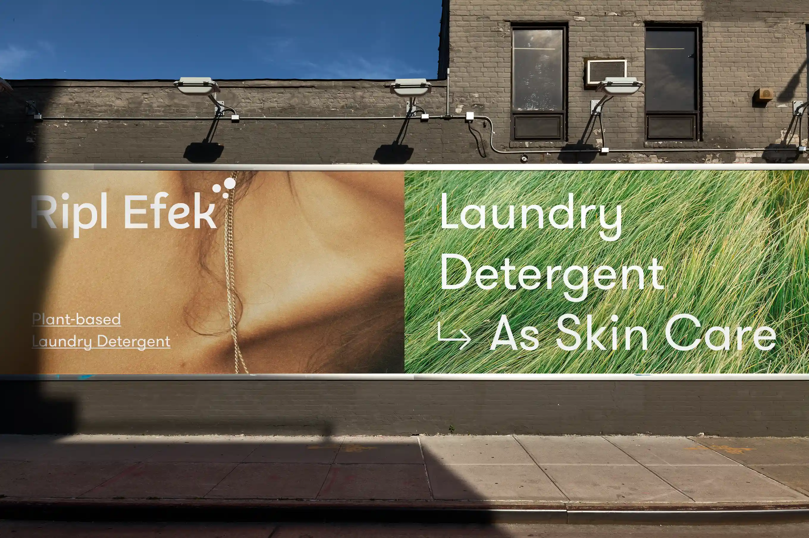
Ripl Efek Bio-based Detergent
Art Direction, Branding, Packaging, Website

Beyond the Streets
Website Design
Next Projects
Ripl Efek Bio-based Detergent
Art Direction, Branding, Packaging, Website
Beyond the Streets
Website Design
Next Projects
Ripl Efek Bio-based Detergent
Art Direction, Branding, Packaging, Website
Beyond the Streets
Website Design